
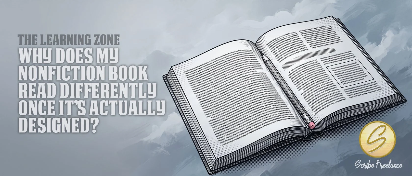
Why Does My Nonfiction Book Read Differently Once It’s Actually Designed?
The manuscript was never wrong. It just hadn't been read yet — not the way the design is about to make it read.
A nonfiction manuscript can look finished on the page and still surprise its own author once it’s laid out. That’s not a flaw in the writing — it’s a limit of what a manuscript can show you before it exists as a real, paginated book.
My name is Daniel J. Middleton — I started Scribe Freelance because I wanted indie authors and publishers to have the same design quality the big houses take for granted. In production work across dozens of nonfiction interiors, the same moment repeats: an author sees the book laid out for the first time and realizes the structure is doing work the manuscript alone couldn’t show them.
This article covers why that happens, what it usually reveals, and why the right response is almost always to trust the design instead of fighting it.
Why Can’t You Fully Judge a Manuscript Until It’s Designed?
A Word document is a stand-in for a book, not the book itself. Order, pacing, callout impact, and final page count are all decisions a manuscript can hold, but none of them can actually be evaluated until the content exists as a real, designed object.
A manuscript can be finished and still not tell you what your book actually needs.
That’s not a criticism of the writing. It’s just the nature of the format — continuous text on a page doesn’t behave the way a typeset, paginated interior does, so some problems and some improvements simply don’t surface until the layout is real.
What Does the Design Usually Reveal?
Three patterns show up constantly across nonfiction production work, and all three are the same moment wearing different clothes.
Clients regularly ask to reorder content once they see it designed. Something read fine in the manuscript, but the clean layout shows a better position for it, or reveals that the original order was never quite right to begin with.
Callout boxes are another one. Authors picture a callout a certain way in their head, and it almost always looks and feels different once it’s actually designed. Not wrong, just not what they expected. A callout does not really exist as an idea until it exists as a designed element.
Page count catches people too. A recent client was surprised by how thick the finished book turned out to be, and asked to shrink the font, which led to second-guessing a trim size decision made earlier. The manuscript never gave a real sense of final scale. Only the designed page count did.
None of that means the design is wrong for surfacing it. It usually means the design is doing exactly what it’s supposed to do — giving the content its first honest read.
What Structural Elements Make That First Honest Read Possible?
Nonfiction interiors rely on a set of structural tools that fiction rarely needs, and those tools are what let a design pass reveal something real in the first place.
None of these tools exist at the manuscript stage. They only get built during layout, which is exactly why a design pass can surface things a manuscript alone never could:
Subheads break long sections into scannable pieces, which is often the first thing that exposes an ordering problem.
A multi-level table of contents mirrors that structure back to the reader, the same way broken links inside an ebook’s own TOC undercut a reader’s ability to navigate a nonfiction book at all.
Running headers orient a reader mid-chapter, something a manuscript has no equivalent for.
Sidebars and callout boxes carry information that would slow the main narrative if it stayed inline, which is exactly why they tend to look different once they’re real.
That’s also why a manuscript can’t fully show what the finished book will do.
Why Do Fiction-Style Defaults Cause This Blind Spot in the First Place?
Continuous prose, no subheads, and a single-level table of contents work fine for a novel, because a novel is meant to be read start to finish in order. Nonfiction manuscripts often get drafted the same way by default, simply because that’s the format a word processor encourages.
The problem is that fiction-style defaults hide the very structure nonfiction depends on. Without subheads, running headers, or a real multi-level TOC, there’s nothing in the manuscript stage to reveal whether the order, the callouts, or the page count are actually working. The blind spot isn’t a mistake the author made. It’s a gap the format itself leaves open until design fills it in.
Where Else Does This Same “You Can’t Fully Know Until You See It” Pattern Show Up?
A few other decisions carry the same limitation, though each deserves its own deeper look elsewhere. Trim size interacts with page count in ways a manuscript can’t preview on its own. Whether footnotes or endnotes serve a book better often depends on how the designed page actually handles the interruption. And a usable index can only be built once real page numbers exist, which means it’s always one of the last structural elements to reveal itself.
What Should You Do When the Design Surprises You?
Treat the surprise as information, not a problem to undo. If a section wants to move once you see it laid out, that’s usually the layout telling you something true the manuscript couldn’t. The same logic applies to margin problems that only show up once a book is physically bound rather than viewed flat — text that looks fine in a manuscript can still get lost near the spine once real pagination and binding are involved.
The design pass isn’t second-guessing the manuscript. It’s the first time the manuscript gets read as a book.
If your nonfiction interior keeps surprising you in ways that are hard to pin down, get in touch and we’ll look at what the layout is actually trying to tell you.