
Why Does My KDP Print Proof Look Different From the Digital Preview?
The gap between your screen and your printed page isn't a mistake to fix — it's the space between light and ink, and once you know that, most "wrong" proofs turn out to be exactly right.
Your KDP print proof looks different from the digital preview because your monitor displays color in RGB light while the printer mixes CMYK ink on paper — two different systems that can’t match exactly. Add in paper stock, screen calibration, and image resolution, and a “surprising” proof is usually just physics working as expected.
That said, “expected” doesn’t mean it should feel like a gut punch when the box arrives.
After nearly twenty years formatting books for independent authors and publishers, I’ve learned that the panicked message almost always arrives the same way: “The proof came in and it’s wrong.” Most of the time, nothing is wrong. The file just needed to be prepared for print in the first place, not just approved on a screen.
This article walks through what actually changes between screen and paper, which shifts are normal, and how to catch the real problems before you spend money on a second proof.
What Causes the Difference Between Screen and Print?
Three factors do almost all the work here, and none of them are KDP’s fault.
RGB vs. CMYK Color Conversion
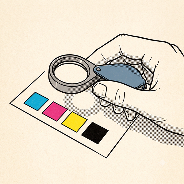
Your monitor builds color from red, green, and blue light. A printing press builds color from cyan, magenta, yellow, and black ink. RGB can produce colors — especially bright blues, greens, and neons — that simply don’t exist in the CMYK ink range. When a file uploaded in RGB gets converted to CMYK for print, those colors shift toward the nearest ink can manage. That’s not a KDP error. That’s the conversion doing its job.
Paper Stock and Ink Absorption
Cream paper absorbs ink differently than white paper, and it also changes how your eye perceives contrast and brightness. A cover that looks punchy on a backlit screen will read warmer and slightly softer once it’s printed on either stock. This is one of the most common surprises for first-time authors, because the digital preview doesn’t fully simulate paper texture.
Screen Calibration and Lighting
Every monitor is calibrated differently, and most aren’t calibrated at all. A screen running warm, cool, overly bright, or overly saturated will show you a version of your book that no printer can reproduce. The room lighting when you open the box adds another variable on top of that.
This isn’t unique to print, either. The same underlying logic — one file, more than one rendering environment, and neither one “wrong” — is why the same ebook can look different from one Kindle device to the next, just on the screen side instead of the press side.
Is Some Color Shift Normal, or Is Something Wrong?
A slight shift in saturation or warmth between screen and print is normal. What’s not normal:
Visible pixelation or blurriness in images that looked sharp on screen
Text that’s blurry, misaligned, or cut off
Colors that are wildly off from the source files — not just muted, but wrong
Streaking, banding, or visible print defects
If what you're seeing is softness rather than a color shift, that's a separate resolution problem, covered in why images turn out blurry in a printed proof.
The first category is expected physics. The second category is usually a file preparation issue that existed before the proof was ever ordered — it just wasn’t visible until ink hit paper.
How Can You Prevent Proof Surprises Before You Order?
A little preflight work solves most of the surprises above before they ever reach your mailbox.
Convert Your Files to CMYK Before Upload
Building your interior and cover files in CMYK from the start — rather than converting at the last minute — gives you a much closer preview of what the printed colors will actually look like, and it lets you catch problem colors before they become a mailed mistake.
For most authors, that’s as far as it needs to go. Minor color variation between screen and print is normal, and once you know that going in, it stops being alarming.
But color precision matters more to some authors than others, and there’s nothing wrong with that. One thriller author I worked with wanted a cover green locked down to an exact shade. Rather than trust a screen preview, I had him run the digital files through a local print shop’s CMYK printer, which let me tweak the hue until it matched what he had in mind. When the final book came back from Ingram, it lined up with the print shop’s version almost exactly — though even two commercial printers will still produce slightly different results from each other.
Order a Proof If Color Accuracy Really Matters to You
If you’re genuinely particular about how your colors translate to print, ordering a physical proof before your full run is the only way to know for certain. For most authors, though, what shows up on screen is close enough, minor variations and all — a proof isn’t something you need to feel obligated to order.
What Should You Do If the Proof Still Looks Off?
If the shift falls into the “expected” category above, you likely don’t need to change anything — that’s simply how the file will always print. If it falls into the second category, the fix usually lives upstream: image resolution, color profile, or margins that were never quite right, not something wrong with KDP’s printing.
That diagnosis is the part most authors don’t have the tools — or the two decades of print production experience — to do on their own. It’s also the part where a second set of eyes saves both money and a launch date.
If your proof came back looking nothing like what you approved, get in touch and let’s figure out what’s actually going on before you order another one.