
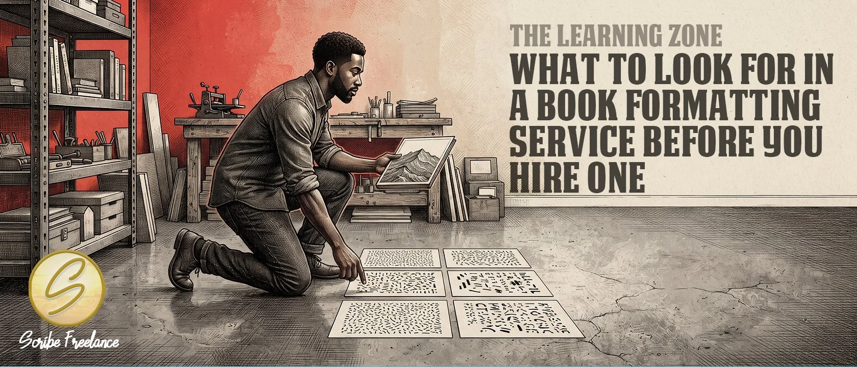
A formatter’s eye for type shows in every page they set. Asking about it tells you what a quote can’t.
What to look for in a book formatter comes down to one question: can they talk knowledgeably about typefaces and how to pair them with imagery, not just place text on a page? Layout mechanics are the minimum, and typography is the tell.
Hiring without a way to judge that is how authors get burned by an unqualified “designer.” A quote shows a price and a turnaround time, and it doesn’t show whether the person understands design fundamentals.
My name is Daniel J. Middleton — I started Scribe Freelance because I wanted indie authors and publishers to have the same design quality the big houses take for granted.
This piece covers the criterion I use, why typography carries so much weight, and what to ask a prospective formatter before you hire.
What Is the Most Important Thing to Look for in a Book Formatter?
Font aesthetics. A good formatter should be genuinely versed in typefaces and in how to pair them with imagery, not merely able to place text on a page.
That’s my own vetting criterion, and I’d apply it to any formatter before looking at anything else.
Why Does Typography Decide Whether a Book Looks Professionally Packaged?
Massimo Vignelli is the example I reach for. He championed Helvetica, and with Bob Noorda he led the design of the New York City subway’s sign system, documented in the 1970 Graphics Standards Manual. That manual specified Standard Medium, a very close relative of Helvetica, and Helvetica itself didn’t become the system’s official typeface until 1989.
The point holds either way: clean sans-serif type doing serious work in a system people use every day.
I see that same instinct everywhere now, from perfume and car advertising to museum placards. Audiences have been conditioned to read that kind of typography as a mark of quality.
Books need the same caliber of fine packaging readers already associate with quality brands. That isn’t only imagery and cover art, because typography sits above all of it. A formatter who doesn’t think about type as seriously as art is missing the part of the job that makes a book read as professionally made.
What Should You Ask a Prospective Book Formatter About Typography?
Ask questions that make them talk about type, not just layout:
Which typefaces do you reach for on body text, and why?
How do you decide what to pair with a cover’s imagery?
What would you avoid for this particular book?
How should the typography change for this book’s genre?
The genre question matters because a Western, a romance, a self-help book, and historical fiction (depending on the period and continent) will each look different. Listen for specifics: named typefaces and a reason for each pairing.
If you want a reference point before that conversation, the best fonts for print book interiors shows what a well-reasoned answer looks like.
The same approach works on the editing side, where what to look for in an editor covers the questions worth asking before you hire one.
Layout skill gets text onto the page, and typographic judgment decides whether the book looks as though a professional made it.
What Should You Do Before Hiring a Book Formatter?
Ask them directly about their type choices and how they decide on pairings before you hire, and check whether their past work shows the same care across body text, headings, and cover.
If you want to see how I handle type across a book, my design portfolio is the place to look.