

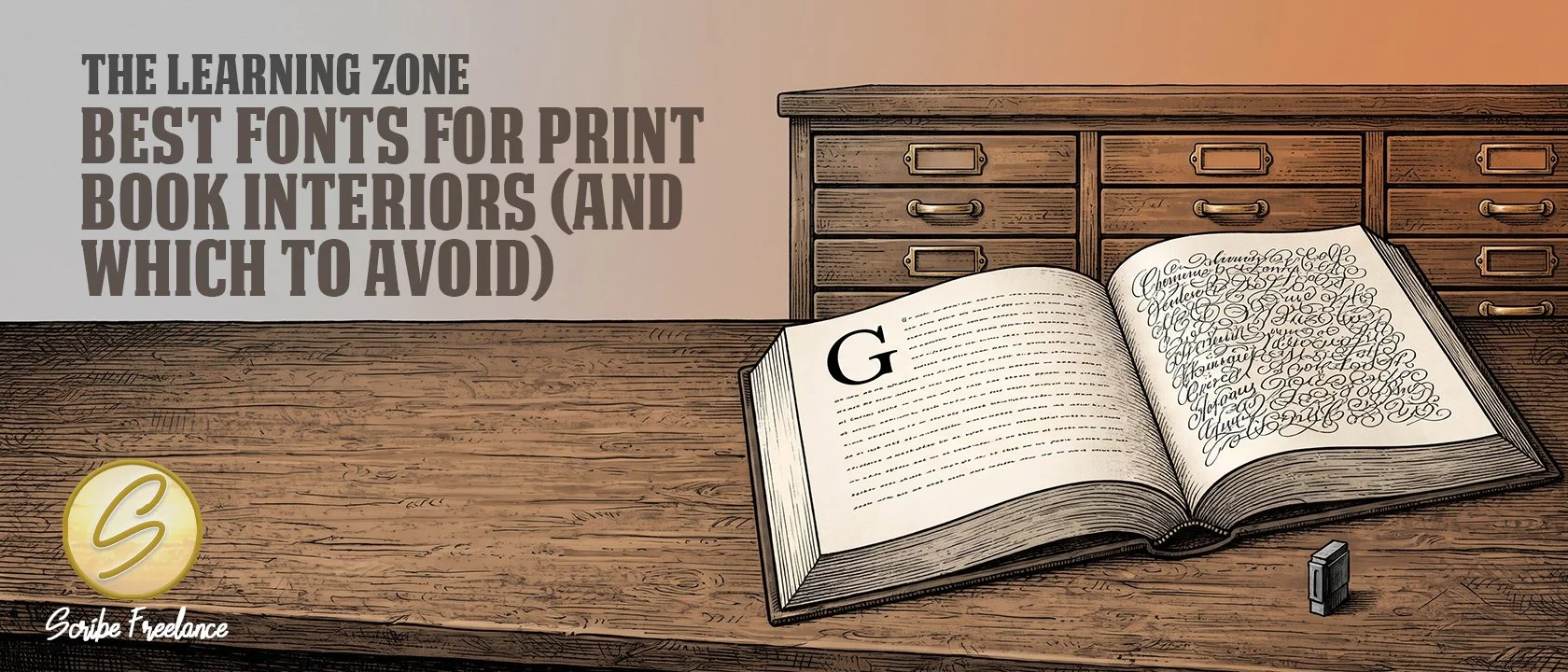
A body font earns its place by disappearing into the reading, and a display font by being noticed once. Choosing between them is where interior type starts.
The best fonts for a print book interior are readable serifs: Garamond, Caslon, and Georgia have been my go-tos for years, and Lora, Alegreya, Merriweather, and Source Serif 4 are newer choices I’ve been reaching for lately. The ones to avoid are default program fonts and decorative display faces.
Authors tend to settle on whatever font Word opens with, or pick something decorative because it looked good in a title. Neither choice holds up, because readability falls apart over the length of a full book.
I’m Daniel J. Middleton, and close to two decades of book design work has left me with one recurring observation: talent is rarely the problem. Process is.
This is my actual working list: what to avoid, what’s proven, what’s new, and what to use for titles and subheads.
Which Fonts Should You Avoid for a Print Book Interior?
Two kinds of fonts cause the most trouble:
Default program fonts. Times New Roman is the classic example, the font nobody actually chose. It tends to make a file look unfinished, as though no one made a typographic decision.
Decorative, cursive, or elegant display fonts. Edwardian Script is the one I’d name. These read well in small doses, like a title, and become genuinely unreadable across a full book.
The second group fails at book length specifically, not in isolation. That’s why a font that looks right on a title page can still be wrong for the body text.
Which Fonts Are Proven Choices for a Print Book Interior?
My longtime go-tos are the Garamond Pro family, Garamond Premier, and Caslon, along with Georgia, which has been a staple for years.
If you don’t have the paid versions, two free fonts from Google Fonts stand in well: EB Garamond for Garamond, and Libre Caslon for Caslon.
Availability and licensing shift over time, so confirm each font’s current terms before you embed it in a print file.
Which Newer Fonts Work Well for Book Interiors?
Lately I’ve been using Lora, Alegreya, Merriweather, and Source Serif 4. They read well in print, and none of them requires expensive licensing.
They’re additions to the older list, not replacements for it. The proven fonts above are still the ones I trust most.
Which Fonts Work for Titles and Subheads in a Print Book?
Titles and subheads do a different job from body text, so I keep their fonts on a separate list: Trajan Pro, Anton, Bebas Neue, Barlow, and Lato.
Check the licensing on these too. Most are free through Google Fonts, while Trajan Pro comes through an Adobe subscription.
A body font earns its place by being forgotten by the middle of the book, while a display font earns its place by being noticed in short doses.
How Should You Pick a Body Font for Your Book?
Choose one from the proven or newer lists above instead of defaulting to whatever Word opens with. Then keep the display fonts for titles and subheads, where they belong.
If you’d rather have the interior set by someone who works with these fonts every day, my design portfolio shows what that looks like.