
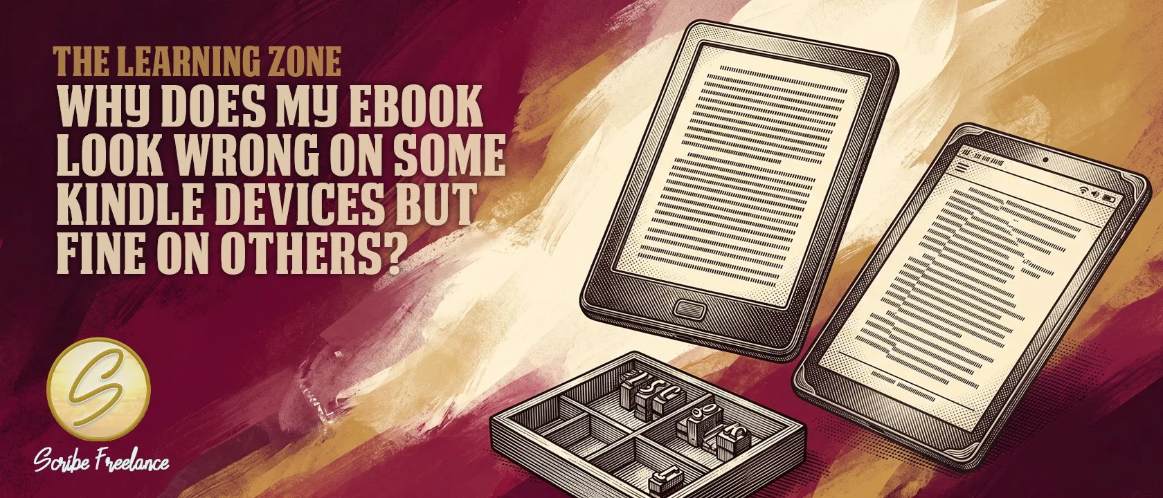
Why Does My Ebook Look Wrong on Some Kindle Devices but Fine on Others?
The file didn’t break. It just met a screen it was never built to bend for.
An ebook that looks perfect on the Kindle you proofed it on and breaks apart on a Fire tablet or the Kindle app on a phone almost never means the file has an error KDP would catch at upload. It usually means part of the file used a fixed value instead of a flexible one, so it holds together on whichever screen checked it and comes apart on the next.
In production work across dozens of ebook conversions, the same pattern shows up constantly: a file reads clean on the device used to proof it, then a spacing rule, a font substitution, or a stray fixed size shows up the moment someone opens it elsewhere. I’m Daniel J. Middleton, and I’ve spent close to two decades formatting books, ebooks included, for authors and publishers who just want the file to work everywhere it gets opened.
This article covers why reflowable text behaves differently device to device, what’s usually driving the mismatch, and how to format so the file holds up no matter what it’s opened on.
What Makes the Same Ebook Look Different on Different Kindle Devices?
A Kindle ebook is reflowable, which means the file doesn’t define fixed pages the way a print interior does. Instead, it hands off structured text and lets each device decide how to lay it out, based on that device’s screen size and whatever font, size, and spacing the reader has chosen.
That reflowable structure comes from the EPUB file format itself — what actually goes into an EPUB file breaks down what KDP is actually converting behind the scenes.
Kindle devices don’t render your file identically — each one interprets the same reflowable code through its own screen size, font, and spacing settings. An older e-ink Kindle, a Fire tablet, and the Kindle app on a phone are three different rendering environments looking at one file. Flexible values adapt cleanly across all three. Fixed ones only crack on the devices they don’t fit.
Why Does a File That Looks Fine on One Kindle Device Break on Another?
The most common cause is fixed sizing where the file should use relative sizing. Font sizes, margins, and indents set in points or pixels hold their exact value regardless of screen size, so they look reasonable on the device used to check them and crowd or overflow on a smaller or larger one. Values set in ems or percentages scale with the reader’s settings instead of fighting them.
A second common cause is styling applied directly to body text — a font, size, or alignment baked into the paragraph itself instead of left at the reader’s default. Styling belongs on headings and special elements, not body text. Body copy that overrides the defaults can look intentional on one device and cause the exact problem it was meant to prevent on another.
How Do Embedded Fonts Play Into Device-to-Device Differences?
Embedded fonts add another layer if they’re not handled correctly. Kindle supports OpenType and TrueType fonts, but older Type1 fonts get silently swapped for a Kindle default instead of failing outright, so the file looks fine in one preview and different wherever the substitution kicks in. Even correctly embedded fonts aren’t guaranteed everywhere — on newer, KF8-capable devices and apps, readers can toggle publisher fonts on or off, so the same file renders in the author’s typeface on one screen and the reader’s own default on another. That’s by design, not an error.
This is the same file-structure logic behind why table of contents links stop working in a KDP ebook — the file does exactly what it was told to do, and the mismatch only becomes visible once it’s opened somewhere the author didn’t happen to check.
How Do You Format an Ebook So It Holds Up Across Every Device?
Use relative units, not fixed ones. Set font sizes, margins, and spacing in ems or percentages so the layout scales with the screen instead of holding a value that only fits one device.
Readers aren’t locked into your choice, either. Most modern reading apps — Kindle, Apple Books, Google Play Books — let readers toggle off the publisher’s font and fall back to their own default, or adjust size independently of what you specified. That’s exactly why a fallback stack matters: your embedded font is a strong first impression, not the only version of the book a reader will ever see. Choose common, well-supported fonts for body text. A decorative font is more likely to trigger a substitution than a standard one, and Kindle’s own defaults are already tuned for consistent rendering.
Test in KDP Previewer across more than one device profile. The device used to proof the file is only one data point — checking it against e-ink, tablet, and app profiles is what actually catches fragmentation before a reader does.
Use section breaks for chapters, not stacked forced page breaks. Excess forced breaks create inconsistent blank screens depending on how much text fits per screen on a given device.
What Should You Do If Readers Are Already Reporting Formatting Problems?
Formatting specs and previewer behavior shift periodically, so check Kindle’s current formatting guidelines rather than relying on a rule that was accurate a year or two ago. Start by opening the file in KDP Previewer across several device profiles, not just the one used originally, since that’s usually where the point of failure becomes visible.
Once identified, the fix belongs at the style level — the CSS rule or paragraph setting causing it — not as a manual patch on the pages where it happened to show up. A patch on one screen size doesn’t travel to the next any better than the original fixed value did.
If you’ve checked the file against current KDP guidelines and it’s still rendering inconsistently across devices, get in touch and we’ll try to track down what’s actually driving it.