
Why Do My Images Look Blurry in My Printed Proof?
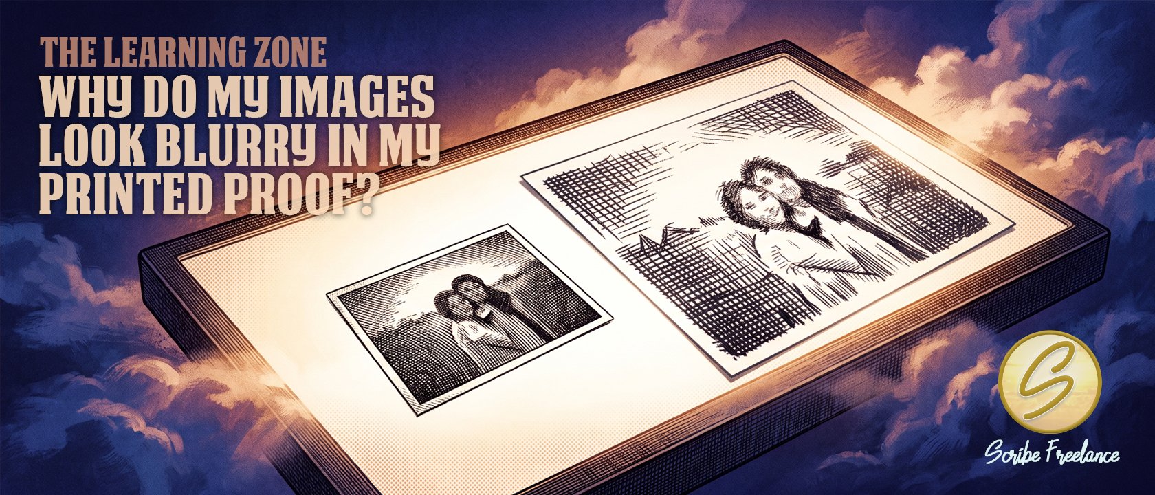
Nothing broke on its way to the press. One image just ran out of pixels before it ran out of frame.
Your images look blurry in a printed proof for one reason almost every time: they don’t have enough real pixel detail for the size you’re printing them at. It’s a resolution problem, not a printing error — the file didn’t get damaged on its way to the press.
I’m Daniel J. Middleton, and after close to twenty years designing books for indie authors and publishers, I’ve seen this problem from the inside as well as the inbox. Scribe Freelance is the in-house creative for a publisher that has spent the past couple of years releasing books from their founding author’s decades-old archive, and several of the original images were pulled from source material nearly fifty years old — far too low-resolution to survive being printed at book size. Recreating them at high resolution didn’t just improve the blur. It eliminated it.
This article covers what actually determines print sharpness, how KDP and IngramSpark handle low-resolution images differently, and how to catch the problem before it shows up in a proof instead of after.
Why Does an Image That Looks Sharp on Screen Print Blurry?
Your monitor displays images at roughly 72 to 100 pixels per inch, and it can stretch a small image to fill a lot of screen space without looking rough — screens are forgiving that way. A printed page isn’t. Book interiors and covers need roughly 300 pixels per inch at the size they’ll actually print, and anything short of that shows up as visible softness, especially around fine detail like text, faces, or thin lines.
The number that matters is effective resolution: the image’s actual pixel dimensions divided by the physical size you’re printing it at — not any DPI number saved in the file’s metadata. A 1,200 by 800 pixel photo prints at roughly 300 ppi if you place it at 4 by 2.7 inches, and blurs badly if you stretch that same file to fill a 6 by 9 page.
A blurry image usually isn’t a bad photo — it’s a photo asked to be bigger than it has the pixels for.
Is a DPI Setting the Same Thing as Image Resolution?
No, and this is where a lot of confusion starts. Photoshop and other editing tools let you type any number into the “resolution” or “DPI” field, and changing that number alone doesn’t add or remove a single pixel from the file. Relabeling a 72 ppi image as 300 ppi doesn’t make it print sharper — it just changes what’s stored in a metadata field that only the software reads.
This is different from a proof color mismatch, which is a shift in hue or brightness, not a loss of detail. If instead your colors are shifting rather than softening — a green that prints muddier than it looked on screen — that’s the RGB-to-CMYK conversion issue covered in why your KDP proof colors don’t match your screen, a related but separate failure mode. Blur and color shift can both show up in the same proof, but they come from different causes and need different fixes.
How Do KDP and IngramSpark Handle Low-Resolution Images?
Both platforms recommend roughly 300 ppi for cover and interior images, but neither one catches every low-resolution image before it prints. KDP’s review process will sometimes flag an image as low resolution during upload, but that check runs against the image as placed in your file — one that passes at a small size can still fail once you stretch it larger inside your layout without re-uploading.
IngramSpark’s preflight review tends to catch more resolution issues before a job goes to press, since it’s built around Lightning Source’s file-checking standards for trade publishers. Even so, it isn’t a substitute for confirming your own placed image sizes before you submit — platform checks are worth double-checking against, not relying on outright, since thresholds shift periodically and shouldn’t be treated as fixed forever.
How Do You Catch a Low-Resolution Image Before It Prints?
Check the math, not the label. Divide the image’s pixel width by the inches you’re placing it at. Below roughly 300, it will show softness in print.
Zoom to 100 percent in your layout software. If it looks soft at true size on your screen, it will look soft on paper — previews at less than 100 percent hide the problem.
Avoid screenshots and web-saved images. Website images are almost always well under 150 ppi at their native size, and stock photo previews are frequently sized for browsing, not printing.
Go back to the original file. A resized copy someone emailed you is rarely the highest-resolution version that exists — ask for the source file before resizing anything further.
If no higher-resolution file exists, recreation may be the only fix. This comes up often with archival or decades-old material: there’s no larger original hiding somewhere, so the image has to be redrawn or rebuilt at print resolution rather than resized.
Don’t stretch to fill space. If an image is too small for where you want it, the fix is a bigger image, not a bigger placement of a small one.
What Should You Do If Your Proof Still Looks Soft?
A blurry proof image almost never means your printer failed you — it means an image got placed at a size its pixel count can’t support. Catching it before you order a proof is mostly a matter of checking effective resolution against your actual placed size, rather than trusting how the file looks stretched across a monitor.
If you’ve checked your resolution and something still looks soft in print, get in touch and we’ll figure out what’s actually feeding the problem.